Map resources from The Map Consultancy
Great cartographers are rare; here are some favorites.
Illustrated maps
Editorial maps
Reference/topo maps
Getting started
💬 Join The Spatial Community Slack and get answers to your geo-questions.
QGIS: open source GIS software for Windows, OSX, Linux
GDAL/OGR: open source command-line GIS tools
Natural Earth: public domain data source for borders, countries, cities, natural features, and more
Resource collections
By Maptime
By Robin Tolochko
By dragons8mycat
By RT Wilson
Humanitarian Data Sets
Tutorials & tips
GDAL/OGR cheat sheet
Intro to GDAL
Intro to satellite data + GDAL
Common satellite data + GDAL operations
Google Earth Engine end-to-end tutorial
Misc.
Square cartogram maker one, and two
Hex cartogram maker
Sankey diagram maker
Map icons
Custom embedded Google Map and markers
Export Mapbox basemaps to JPEG
Color palette generator
In-browser land cover classifier
Cartography tutorials
Carl Churchill’s shaded relief tutorials
Daniel Huffman’s map tutorials
D3 cartography
Command line cartography with mapshaper
Data cleaning
Excel geocoder
Paste-in-addresses geocoder
Change DMS coordinates to decimal degrees
Generate a DEM from LIDAR
Inspiration
Historical NOAA nautical charts
U.S. National Archives
American Geographical Society Collection
National Library of Scotland
British Library
Boston Library
David Rumsey Map Collection
USGS historical topographic maps
Public domain shaded reliefs
New York Public Library map collection
MAPSTER European wartime map collection
Perry-Castañeda Library Map Collection
Osher Map Library
Data sources: land cover, elevation
Land cover
10m global land cover (ESRI)
30m U.S. land cover (NLCD)
30m U.S. croplands
30m North American land cover
30m global land cover
100m global land cover
300m global land cover
Elevation
100m CONUS shaded relief + land cover
30-90m elevation data
Elevation data finder: openterrain
Elevation data finder: opendem
Elevation data finder: opentopography
Elevation data finder: imagico
Bathymetry finder
Antarctic bathymetry
Data sources: satellite imagery
Remote sensing basics
Google sheet of satellite imagery browsers and APIs
250m Blue Marble
Sentinel-2 + Landsat 8 browser: Sentinel Playground
Sentinel-2 + Landsat 8 browser: EO Browser
MODIS/VIIRS browser
GOES-16 browser
Sentinel-1 browser
Download by lat/long from all of NOAA’s sensors
High-resolution imagery browser (expensive)
Tim Wallace’s satellite imagery resources
How to find the most recent imagery
Charlie Loyd’s imagery compendium
U.S. wildfire perimeters
Data sources: street-level
Download OpenStreetMap raster tiles
Download OSM data by bounding box
Download OSM data by city
Download OSM data by country
U.S. Census Bureau Cartographic Boundary Shapefiles
U.S. Census Bureau TIGER/LINE data by county
Building footprints for the U.S., Canada, Tanzania, Uganda
Global city boundaries
Demographics
U.S. Census geodata
Slippy maps
XYZ layers by RobLabs
Three tips for better maps.
❶ Tell one story.
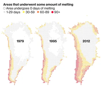
When your map needs to get a message across, keep it simple: you only get a few seconds of your readers’ attention. This map for Bloomberg Businessweek gives a quick read on ice sheet melting in Greenland.
❷ Show the terrain.
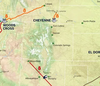
We live on bumpy territories, not flat maps. Include the hills and valleys to connect your audience to the map area, as we did for this HollyFrontier project that shows land cover and mountains.
❸ Use fewer colors.
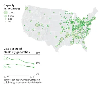
Maps are complex graphics, so keep yours easy to read. For this Bloomberg Philanthropies annual report map, we used one color on muted terrain to make the information pop.